 Fluent Svelte
 PersonPicture
Edit This PageThe person picture control displays the avatar image for a person, if one is available; if not, it displays the person’s initials or a generic glyph. You can additionally insert your own badge at the top of the picture, and provide your own inner content.
import { PersonPicture } from "fluent-svelte";Usage
Setting a Photo
Similarly to HTML’s <img /> element, you can set the src property to a URL of an image.
<PersonPicture src="https://source.unsplash.com/random" />It’s recommended for both accessibility and fallback purposes that you provide an alt property for the image as well. The alt attribute is used by screen readers to provide a description of the image to visually impaired users.
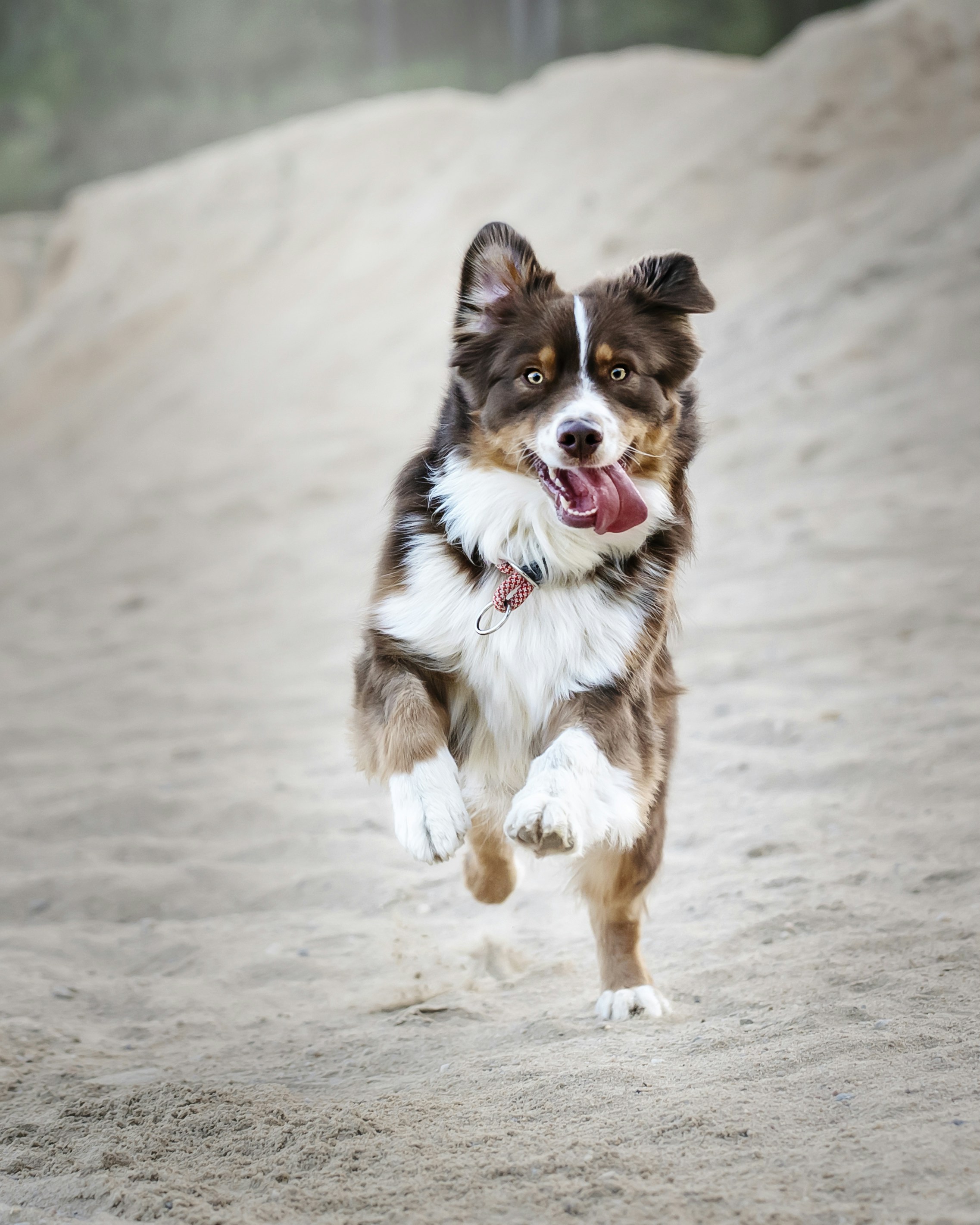
<PersonPicture
	alt="Dog runs through the snow"
	src="https://images.unsplash.com/photo-1530126483408-aa533e55bdb2"
/>
Additionally, if src is invalid and no slot text is inserted, the alt text will be converted to initials format as a fallback.
<PersonPicture src="not-a-real-domain" alt="John Smith" />Custom Text
If no src is provided, you can provide your own text to be displayed in the control. The order of display is:
- If a valid image URL in
srcis provided, it will be displayed. - If the
srcattribute fails to display or is invalid, the text or HTML is passed into the default slot will be displayed. - If
srcis invalid, no slots are used, but analtproperty is provided, the alt text will be converted to initials format and displayed.
<div style="display: flex; gap: 12px;">
	<PersonPicture>RDJ</PersonPicture>
	<PersonPicture src="not-a-real-domain" alt="Robert Downey Jr." />
</div>
Badges
You can use the component’s badge slot to insert an offset element at the top of the picture. It’s recommended that you use the InfoBadge component for this.
<script>
	import { InfoBadge, PersonPicture } from "fluent-svelte";

	let messages = 4;
</script>

<PersonPicture src="https://thispersondoesnotexist.com/image" alt="John Smith">
	<InfoBadge slot="badge">{messages}</InfoBadge>
</PersonPicture>
Size
You can control the dimensions of the picture in pixels by setting the size property. The default size is 72.
<PersonPicture size={8} />
<PersonPicture size={16} />
<PersonPicture size={32} />
<PersonPicture size={64} />
Component API
API docs automatically generated by sveld and vite-plugin-sveld.Props
| Name | Type | Default | Description |
|---|---|---|---|
size |
number |
72 |
The size of the picture in pixels. |
src |
any |
undefined |
Source URL used for the picture. |
alt |
any |
undefined |
Defines the alt text used if an `src` attribute is specified. Also used as fallback text if no `src` or slot text is provided. |
element |
null | HTMLDivElement | HTMLImageElement |
null |
Obtains a bound DOM reference to the inner picture element. |
containerElement |
null | HTMLDivElement |
null |
Obtains a bound DOM reference to the outer picture container. |
Slots
| Name | Slot Props | Fallback |
|---|---|---|
Unnamed (Default) |
{} |
{alt
					?.split(" ")
					.map(i => i.charAt(0))
					.join("")
.toUpperCase() ?? ""} |
badge |
{} |
Empty |
Events
All DOM events are forwarded to this component's respective elements by default. Learn More
Dispatched Events
None